

The Impact of Typography on Web Design: A Comprehensive Guide to Aesthetics and Readability
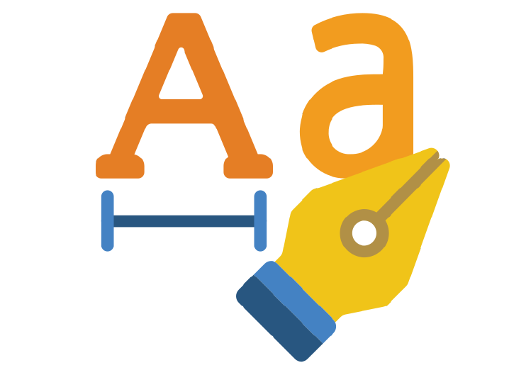
Typography
In the realm of web design, typography holds immense power. It is not merely about letters and words; it’s about creating an immersive experience for users. The choice of fonts, their sizes, spacing, and colors all contribute to the aesthetics and readability of a website. By understanding the nuances of fonts, sizes, spacing, colors, and responsiveness, designers can craft websites that not only captivate the eye but also engage the mind. Implementing these fundamental principles of web typography guarantees an enhanced user experience, where aesthetics and readability converge harmoniously, leaving a lasting impression on visitors.
Further in this article, we will unknot the elaborate world of web typography, breaking down complex principles into simple, easy-to-understand concepts.
- Choosing Fonts: Fonts are the backbone of web typography. The selection of an appropriate font style can define the website’s personality. Serif fonts, with their elegant curves, often exude professionalism and formality, making them suitable for academic or corporate websites. In contrast, sans-serif fonts, characterized by their clean lines, offer a modern and minimalistic vibe, ideal for contemporary and creative platforms.
- Size and Hierarchy: The size of the text matters significantly. Headers should grab attention with larger, bold fonts, guiding users through the content. Subheadings and body text, in a smaller size, ensure a smooth flow of information. Proper hierarchy not only enhances readability but also organizes content, making the website user-friendly.
- Spacing and Line Height: Adequate spacing between letters, words, and lines prevents text from appearing cluttered. Kerning, the adjustment of space between individual characters, is crucial for legibility. Additionally, appropriate line height ensures that lines of text do not overlap, making it easier for readers to follow along without getting lost.
- Colors and Contrast: Color choice impacts both aesthetics and accessibility. High contrast between text and background enhances readability, especially for users with visual impairments. Additionally, the psychology of colors plays a role in eliciting emotions; warm tones create a friendly atmosphere, while cooler shades evoke calmness and professionalism.
- Responsiveness and Compatibility: With the rise of mobile devices, responsive typography is paramount. Fonts should adapt seamlessly to different screen sizes, ensuring readability on various devices. Compatibility across browsers is equally important, guaranteeing a consistent typographic experience for all users, regardless of their choice of browser.
Typefaces
In the intricate world of typography, typefaces play a pivotal role, transforming plain text into visually compelling narratives. These typefaces are often classified into distinct categories, each with its unique characteristics and purposes, guiding designers to create visually appealing and readable content. There are several classifications of typefaces: serif, sans serif, slab serif, script, monospaced, and display.
Serif Typefaces: Adding Sophistication with Subtlety
Serif typefaces, characterized by their small decorative strokes or "feet" at the ends of letters, exude a timeless elegance. These delicate embellishments, while subtle, add a touch of sophistication to the text, making serif fonts a popular choice for formal documents and classic literature. The serifs guide the reader’s eyes smoothly across the text, enhancing readability and imparting a sense of tradition and authority.
Sans Serif Typefaces: Embracing Modern Simplicity
In stark contrast, sans-serif typefaces, as the name suggests, lack these decorative strokes. They offer a clean, modern, and unadorned appearance, making them highly popular in contemporary digital interfaces. The absence of serifs provides a sleek, minimalist look, which not only suits digital platforms but also ensures clarity and legibility, especially on screens with lower resolutions. However, as technology advances and screens boast higher resolutions, the choice between serif and sans-serif may shift, emphasizing aesthetics and design intent over screen limitations.
Script and Display Typefaces: Infusing Creativity into Headlines
Beyond the realm of body text, script and display typefaces come into play, adding a creative flair to headlines, titles, and logos. Script typefaces mimic the fluidity of handwritten calligraphy, injecting a sense of elegance and personality into design. Display typefaces, on the other hand, come in a myriad of styles, from bold and ornate to playful and whimsical, making them ideal for grabbing attention and conveying a brand’s identity.
Monospaced Typefaces: Precision in Every Character
Monospaced typefaces, although not as ornate as serifs or as modern as sans-serifs, have a distinct purpose. Originally designed for typewriters, these fonts allocate equal horizontal space to each character, ensuring precision and alignment. While primarily used for displaying code due to their clarity and easy readability, monospaced fonts can also find a place in body and headline copy when a clean and structured appearance is desired.
Choosing the Right Path: Serif vs. Sans-serif
When it comes to the choice between serif and sans-serif, designers weigh the timeless elegance of serifs against the modern simplicity of sans-serifs. Serifs, with their graceful embellishments, evoke tradition and formality, guiding readers through scholarly texts and official documents. Sans-serifs, on the other hand, offer a contemporary, clean look, perfectly suited for digital interfaces and modern branding.
Font Styles
Typefaces offer a spectrum of styles, encompassing regular, bold, italic, and bold italic variations. When these style elements are applied to a typeface, we create what is commonly known as a “font.” These style variations play a pivotal role in creating contrast and emphasizing specific content within the text, enhancing both aesthetics and readability.
Best Practices in Typography:
- Consistency in Font Selection:A crucial aspect of good design is maintaining a harmonious visual experience. Avoid the temptation to overwhelm your website with a multitude of fonts. Excessive font variation can lead to a cluttered and unprofessional appearance. Instead, limit your font choices to one or two that complement each other seamlessly, ensuring a consistent and pleasing visual identity.
- Alignment for Paragraph Presentation:
- The alignment of text – whether it’s left, right, center, or justified (evenly spaced on both sides) – significantly influences the overall appearance and readability of your content.
- For optimal reader-friendliness, prefer a flush-left alignment for paragraphs. The ragged-right alignment provides clear visual cues at the end of each line. Justification comes into play when lines exceed 60 characters in length.
- Line length: Enhancing Readability
- Optimal Line Length: Aim for 60 characters per line, ensuring comfortable reading. On mobile devices, adjust to 30-40 characters for optimal display. Balanced line lengths enhance focus and comprehension.
- Grids, Layout, and Character Spacing:
- Structured Consistency: Embrace grids for a consistent layout, ensuring content alignment. Implement kerning for even character spacing, achieving a polished, professional look.
- Appropriate line spacing and white space:
- Harmonious Layout: Set line height at 125% of the text size, promoting readability. Maintain 150% of x-height as white space between lines, enhancing the overall aesthetic appeal.
- Prioritising Hierarchy and structure
Implement a well-defined hierarchy in text presentation, emphasising important content and maintaining consistency across devices.- Visual Hierarchy
- The size of a text has a major impact on the reading experience of users. It should contain hierarchical elements to separate the blocks and improve communication.
- A basic typography hierarchy includes the titles or headers, subtitles, and body text. Example H1, H2,H3, H4, H5 etc
- Headings are on the top of the typographic hierarchy and therefore, are more prominent in size and weight.
- It’s common to have different sizes of body text, so choose typefaces that work well in other sizes. Systems leverage a type scale to offer body text sizes — usually named text or body — that include small, medium, or large. This way, you have more flexibility to work with the body text according to where it’s written in the interface.
- Structured Text
- Break up lengthy paragraphs using headings, subheadings, bullet points, and images to enhance text comprehension
- Visual Hierarchy
- Opting for Accessibility
Clarity is Key: Opt for easy-to-read fonts, especially on smaller screens, ensuring accessibility for all users. Steer clear of intricate cursive styles. Ensure clear distinctions between similar characters like ‘i’ and ‘l,’ preventing confusion and enhancing user experience.
In captivating crafting text experiences, these practices serve as guiding principles. By embracing the nuances of font styles, alignment, spacing, and accessibility, designers can transform words into captivating narratives, capturing the reader’s attention, and fostering a deeper connection between content and audience.
Additional Tips for Effective Web Typography
In the art of web typography, it’s not just about choosing fonts and styles; it’s also about ensuring a seamless reading experience for users. Here are some valuable tips to make your text visually appealing and easy to understand, enhancing both aesthetics and user-friendliness:
- Avoid Excessive Capitalization:
Ease of Reading: Refrain from using all capital letters for lengthy sentences and paragraphs, as it can hinder readability. Opt for sentence case or title case to make the text more reader friendly. - Consider Color Accessibility:
Inclusive Design: Think beyond color and consider alternative methods for conveying essential information, mindful of users with color blindness. Ensure that crucial information is presented in a way that all users can understand. - Ditch Blinking or Flashing Text:
Minimize Distraction: Resist the temptation to use blinking or flashing text, as it can be distracting and potentially harmful to some individuals. Focus on providing a calm and consistent reading experience. - Prioritize Color Contrast:
Readability First: To ensure easy reading, make sure that text stands out against the background. Adhere to color contrast guidelines to enhance legibility, catering to users with various visual abilities. - Consider Font Size:
Size Matters: When selecting a typeface, keep in mind that serifs can be challenging to read at small sizes. Opt for sans-serif fonts for smaller text, enhancing clarity and comprehension. Additionally, avoid italic styles for small text, as they can reduce legibility.
In the world of web design, typography serves as a fundamental element that can either facilitate or impede the consumption of content. By following these straightforward guidelines, you can create a website that seamlessly combines aesthetics with user-friendliness, ensuring that your message is not only visually appealing but also easily understood by a diverse range of users.